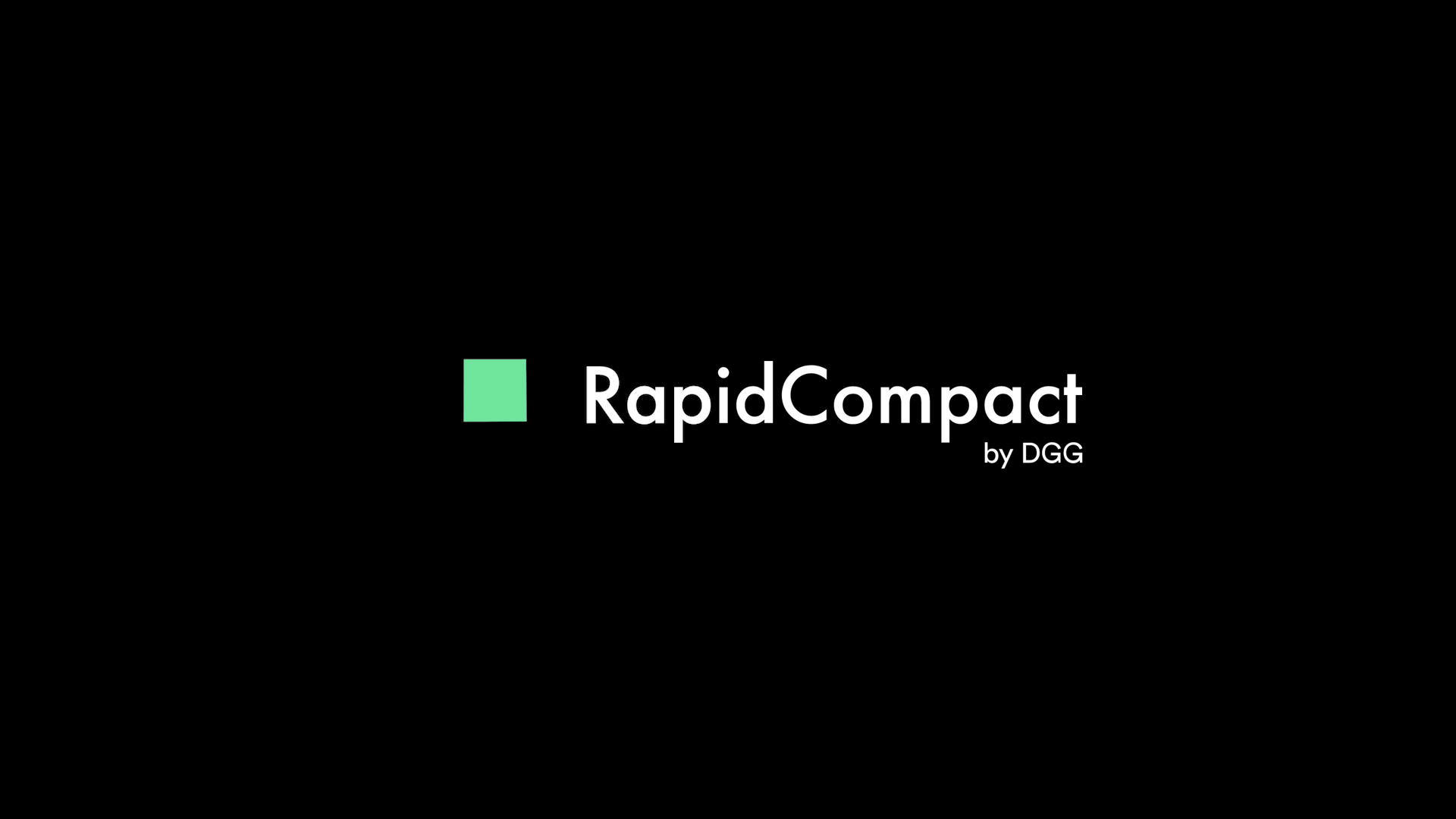
Rapid Compact
About
| Project |
| Brand: Rapid Compact |
| Client: DGG |
| Year: 2019 |
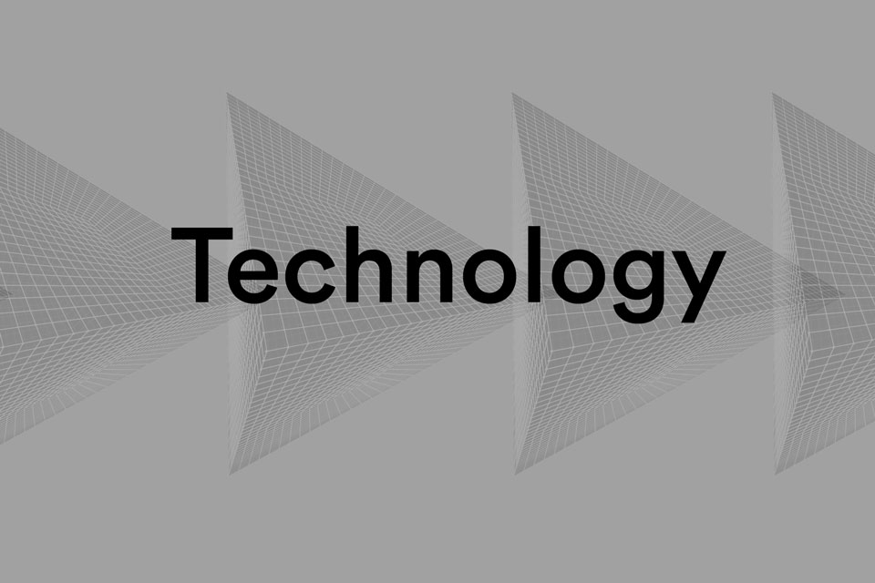
| Industry: 3D, Technology |
| Location: Germany |
| Deliverables |
| Visual Identity |
| Web Design |
| Web Development |
| Brand Guidelines |
| Animation |

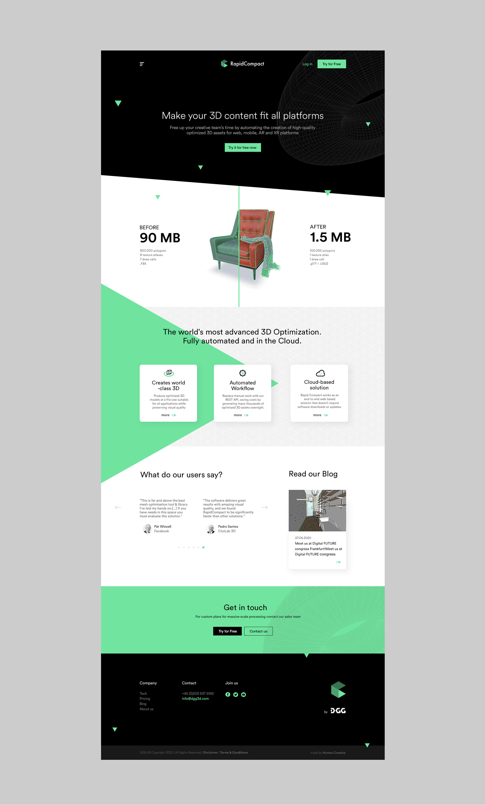
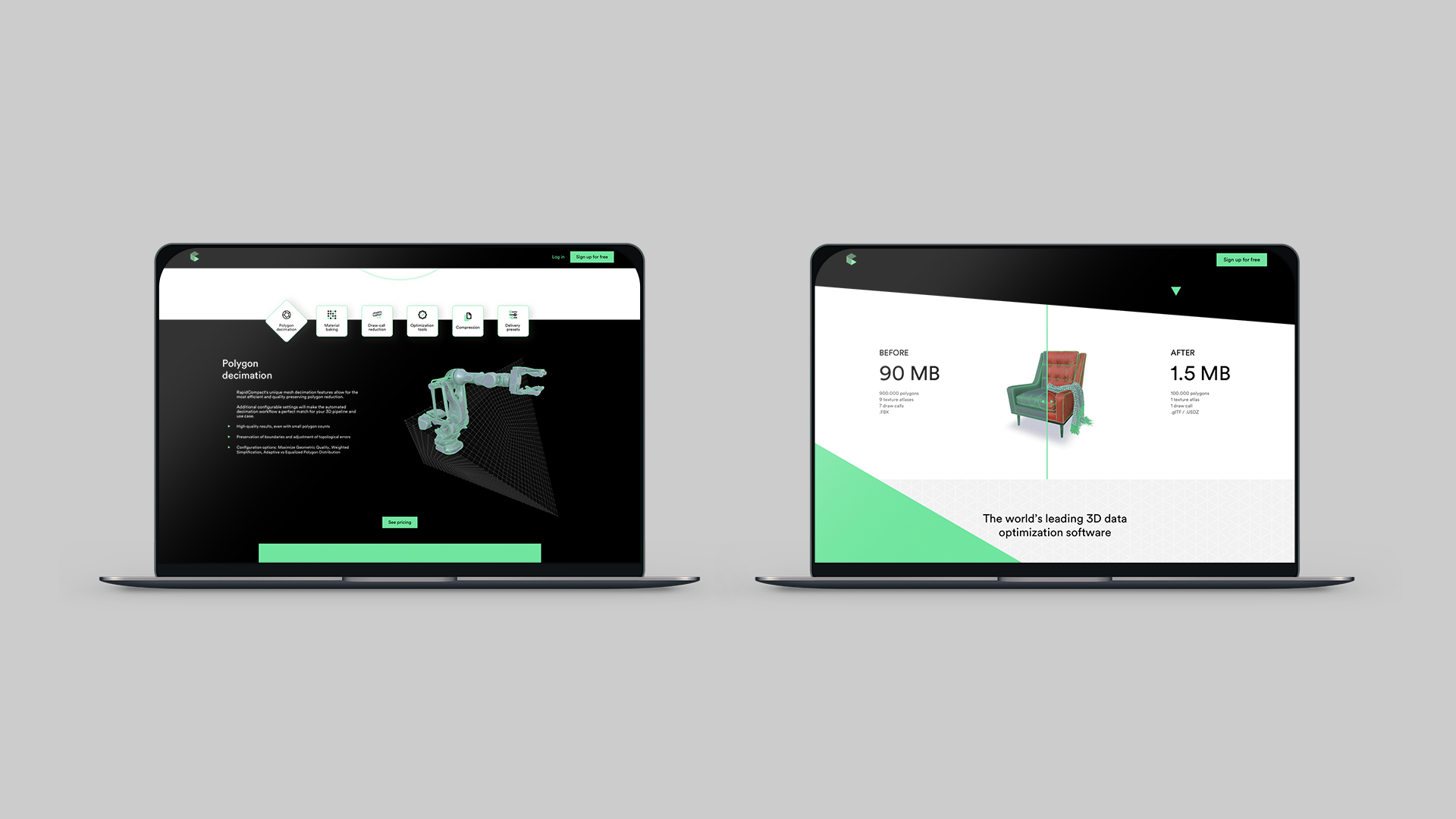
Rapid Compact is a product of the German company DGG, which allows you to quickly and automatically optimize 3D files. There is no need for complex and expensive software to compress, export or convert 3D files by yourself. The company’s previous communication was incomprehensible because the division between DGG itself and the company’s Rapid Compact product was blurred. Therefore, when creating the new image, it was crucial to simplify the message and to focus the viewer’s attention on the product itself, which is Rapid Compact, and to show its possibilities.
It was crucial to simplify the message and to focus the viewer’s attention on the product itself.
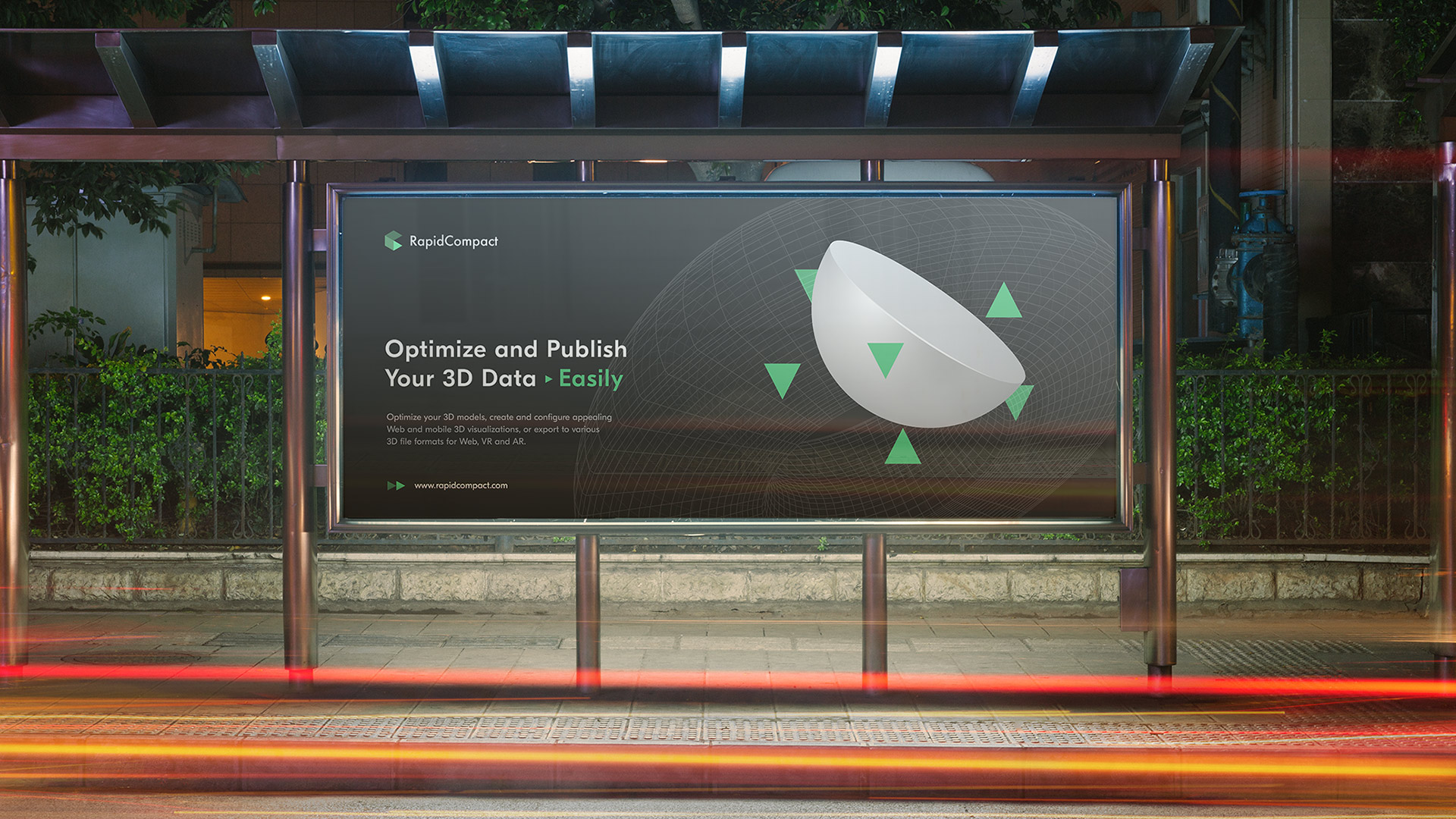
When designing the new image, it was essential that the company would not be associated with creating and generating 3D visualizations. Rapid Compact deals with automatic processing of already finished 3D, so it belongs to a completely different category, which is emphasized in the new visualization. Our benchmark became companies working in the SAAS model, and in the visual layer we avoided presenting characteristic 3D models, which could be confusing for the audience.
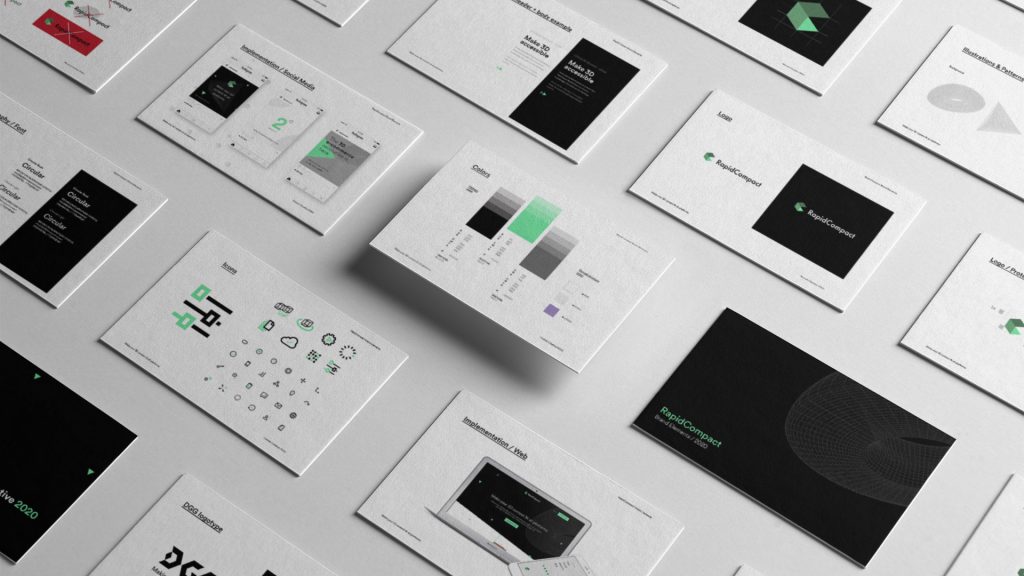
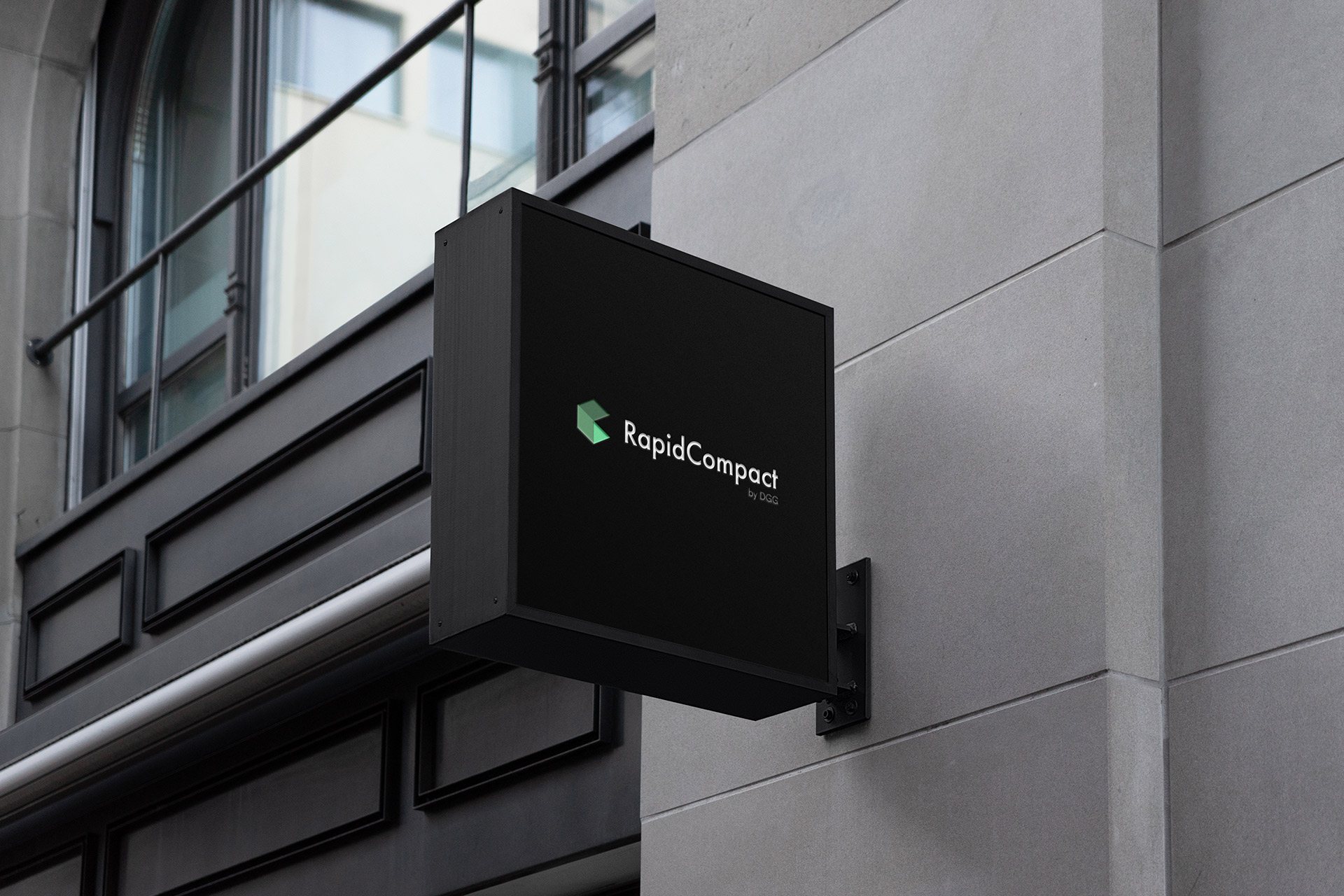
The new identity refers to the previous company logo, which was already recognizable in the 3D industry, but now strongly simplifies and modernizes it.
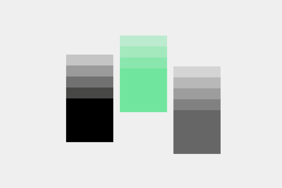
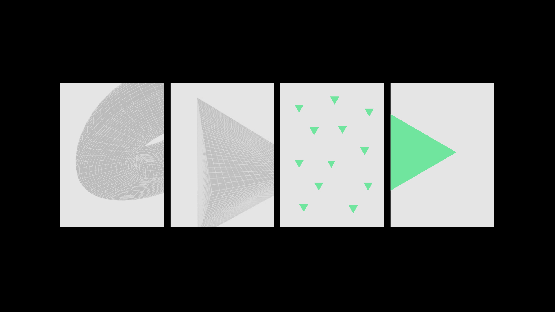
The signet represents a 3D solid and is composed of a green triangle, which is the graphic theme of the new image. The green triangle symbolizes the process, action, and automation of activities – the core values of the company. The geometric form of the signet has great kinetic potential and works in the created animations.
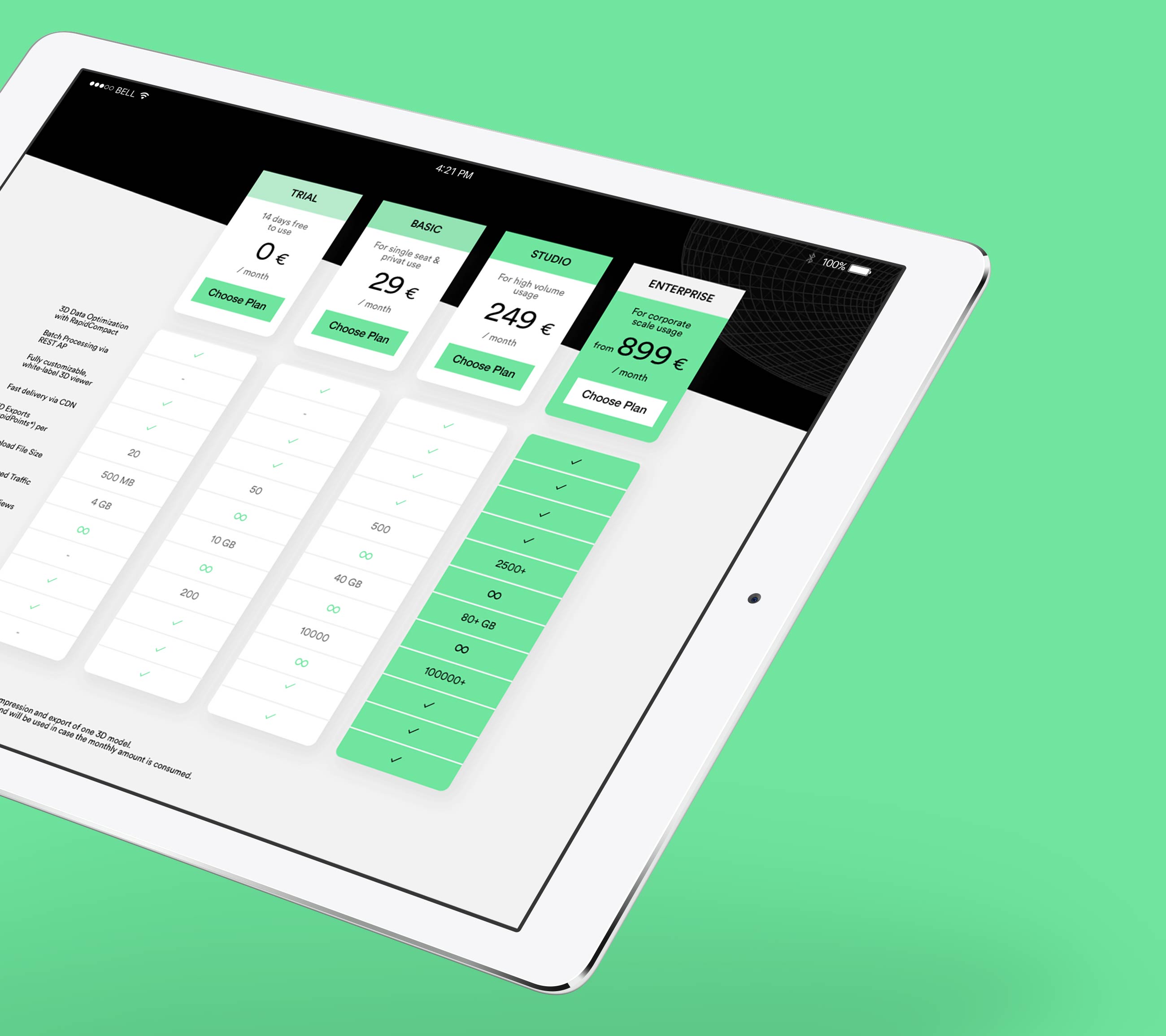
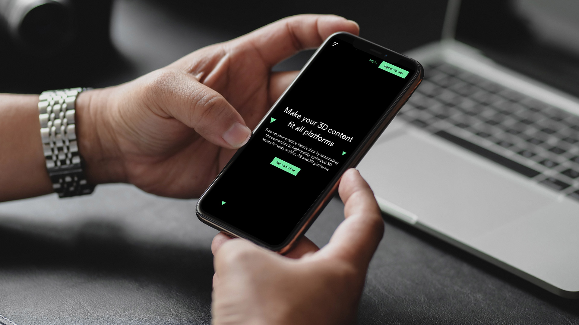
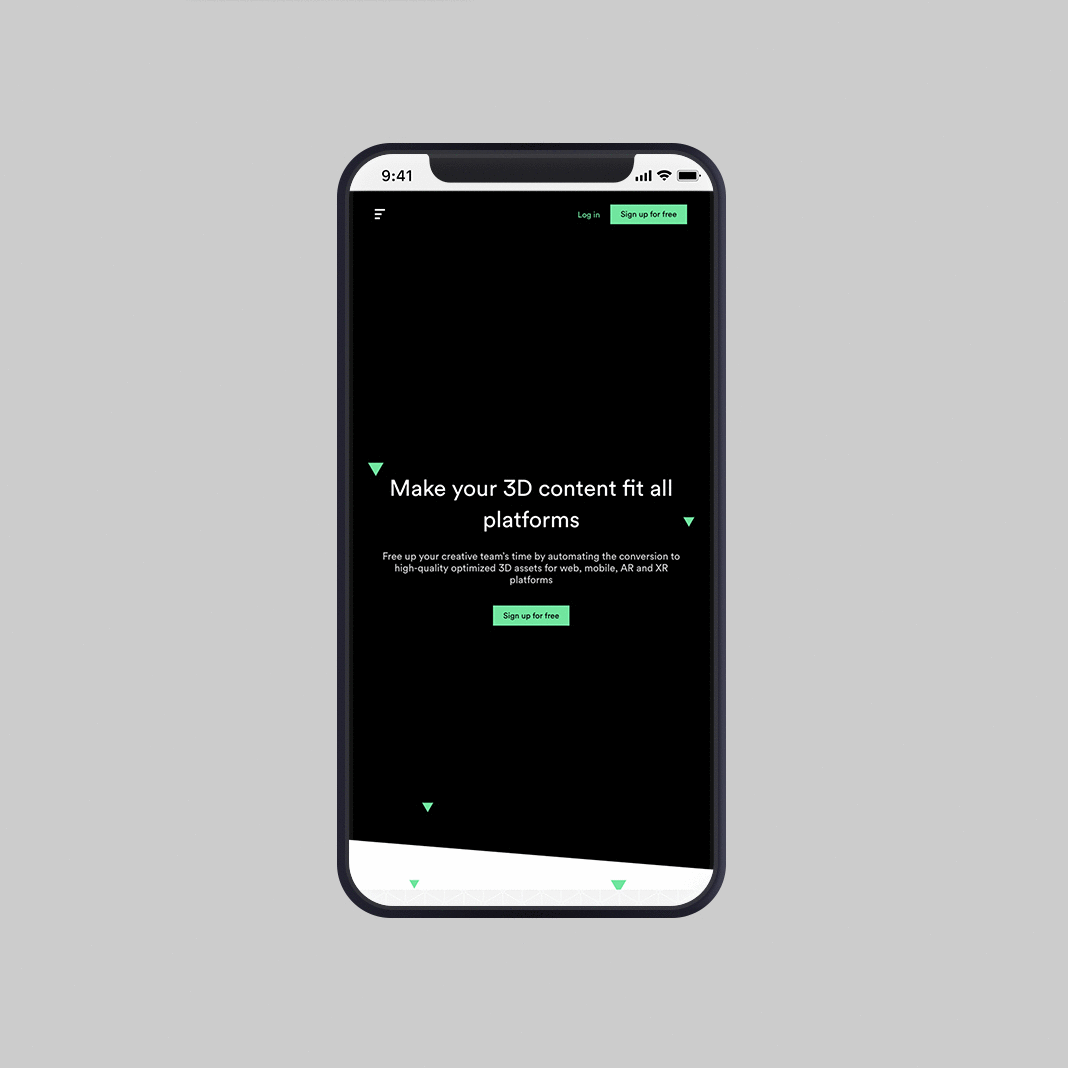
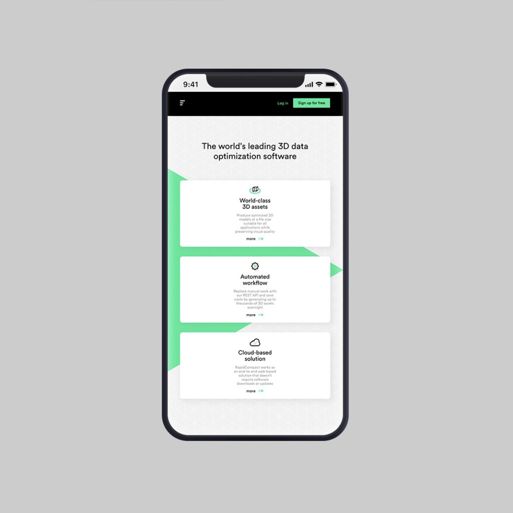
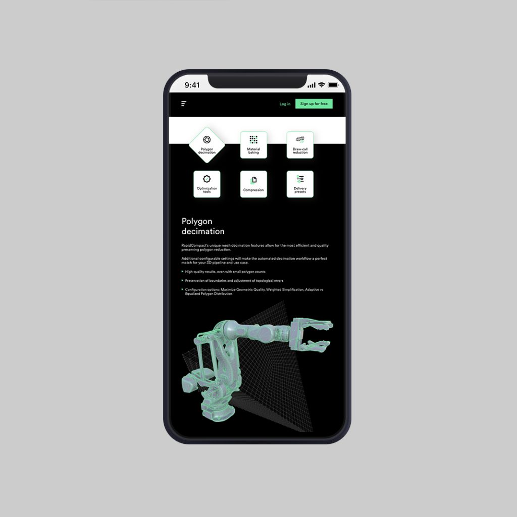
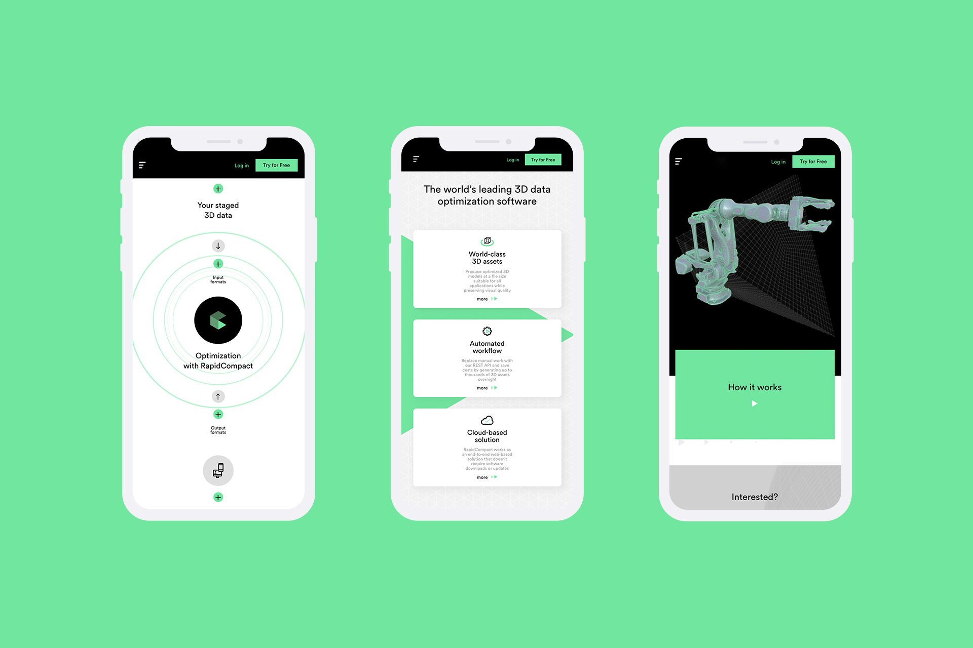
The client’s previous website was a collection of subpages added by the client from time to time, which resulted in a chaotic and complicated set of information. Therefore, while working on the new website, we focused on improving its UX, minimizing the number of subpages and replacing long texts with graphics. Less is more.