Polished Analytics
10 |
| weeks from strategy to launch |
4 |
| strategic visual territories explored |
| Project |
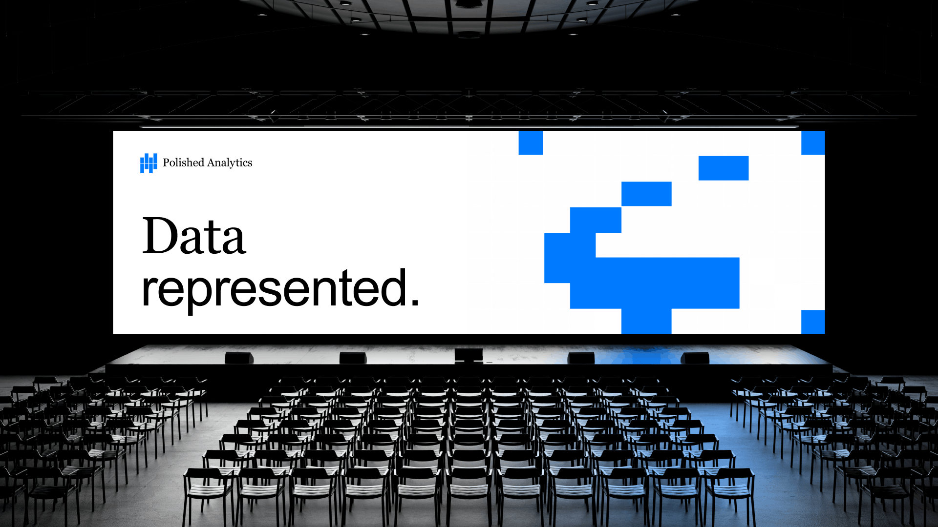
Creating a software brand that reflects decades of Excel analytics expertise. The goal wasn’t simply to design a logo and landing page. It was to turn decades of technical expertise into a brand that felt polished, credible and ready for an alpha release. |
About
| Project |
| Brand: Polished Analytics |
| Stage: Start-up |
| Year: 2026 |
| Industry: B2B Software / Excel Analytics / Financial Analysis |
| Location: United States |
| Deliverables | ||||||
| Brand Strategy | ||||||
| Visual Identity | ||||||
| UX/UI Design | ||||||
| ||||||
| live website polishedanalytics.com |
| Insight |
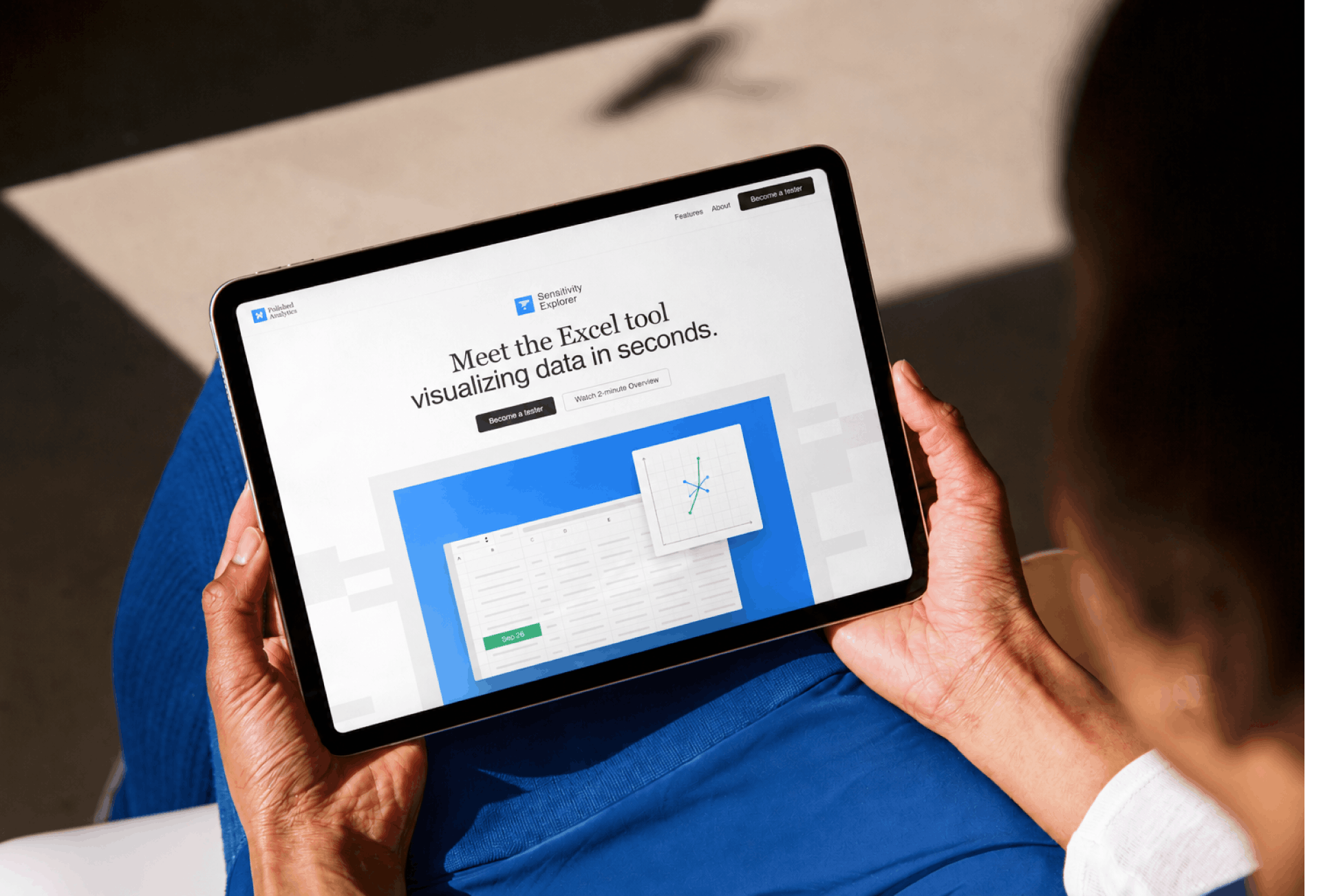
Polished Analytics was a new company built on decades of Excel analytics expertise. Its first product needed a brand that felt clear, credible and ready for professional users. |
| Challenge |
Creating a brand that worked equally well as a software company, product and interface. Every element needed to scale from marketing materials to tiny UI icons inside Excel. |
| Context |
The founders had spent decades building analytical software before launching Polished Analytics and its first product, Sensitivity Explorer. |
| Solution |
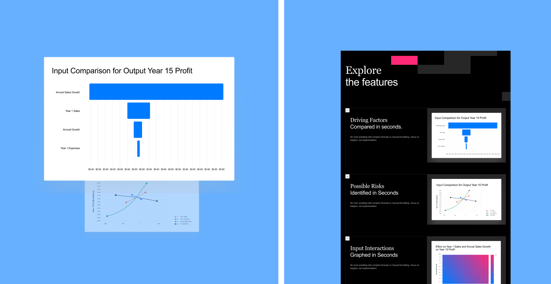
We created a scalable brand system connecting the company, its first product and the alpha website into one consistent experience. |
| Strategy before visuals |
Before designing, we focused on the product, the founders’ experience and the context in which the software would be used. Polished Analytics had to feel new, but not inexperienced. The brand needed to communicate precision, quality and trust from the first release. |
| User reality |
The audience was not looking for entertainment. They needed a tool that could help them analyse complex Excel models faster and with more confidence. Every design decision had to support one idea: making analytical relationships easier to see and understand. |
| Building the system |
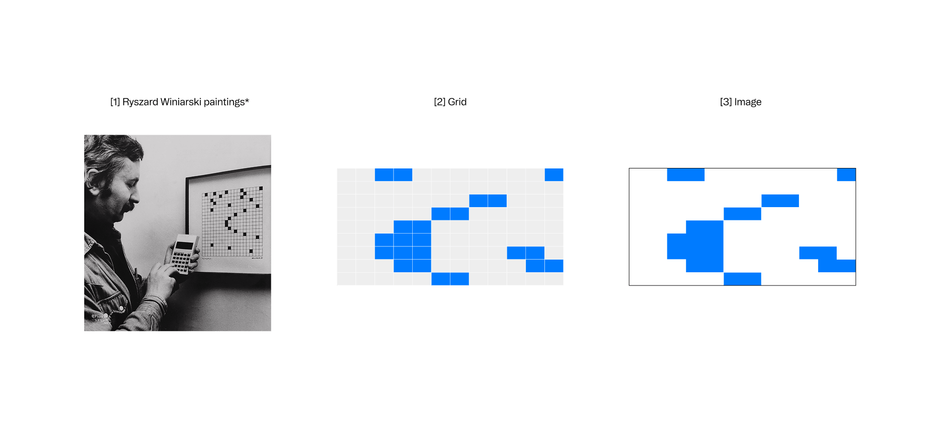
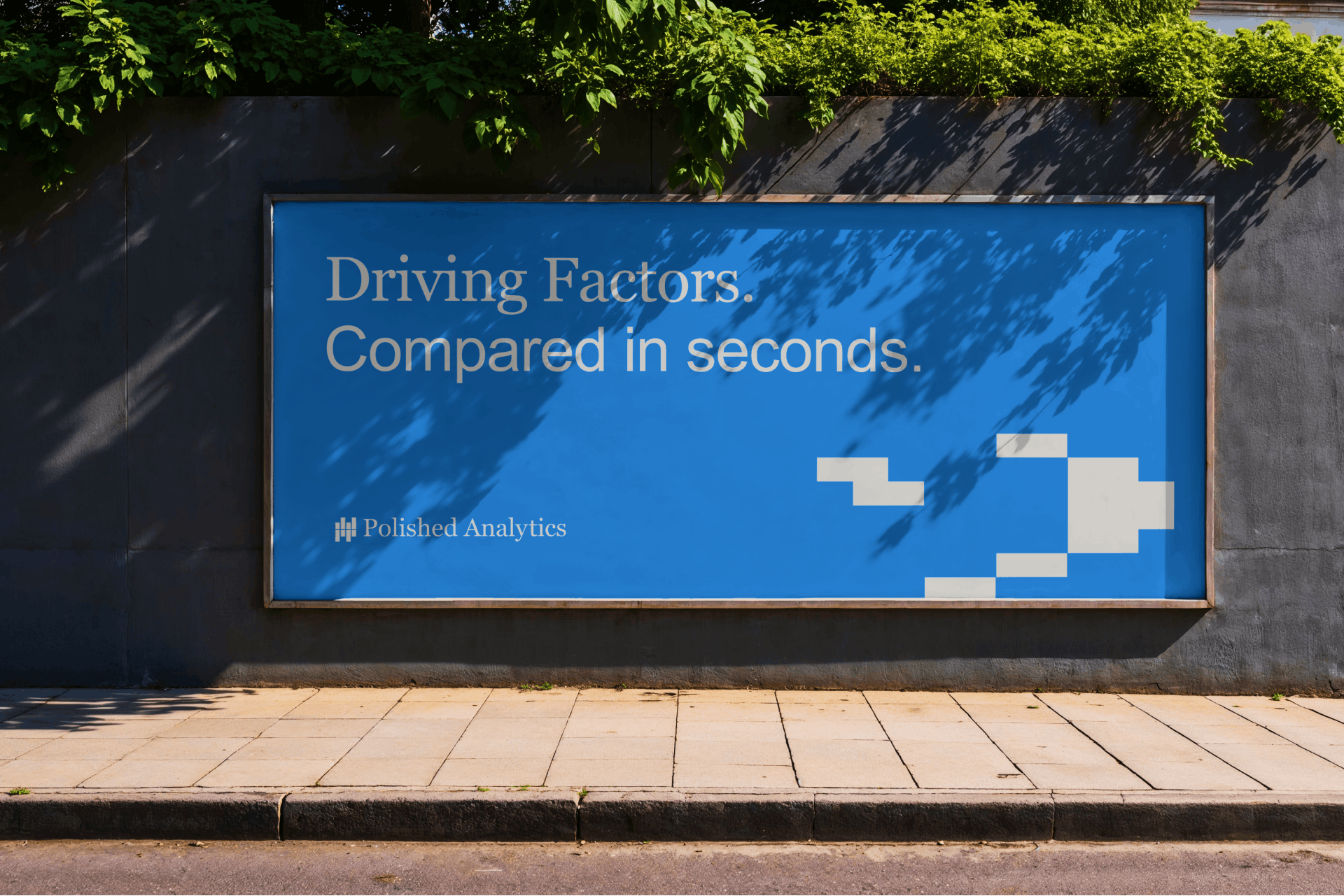
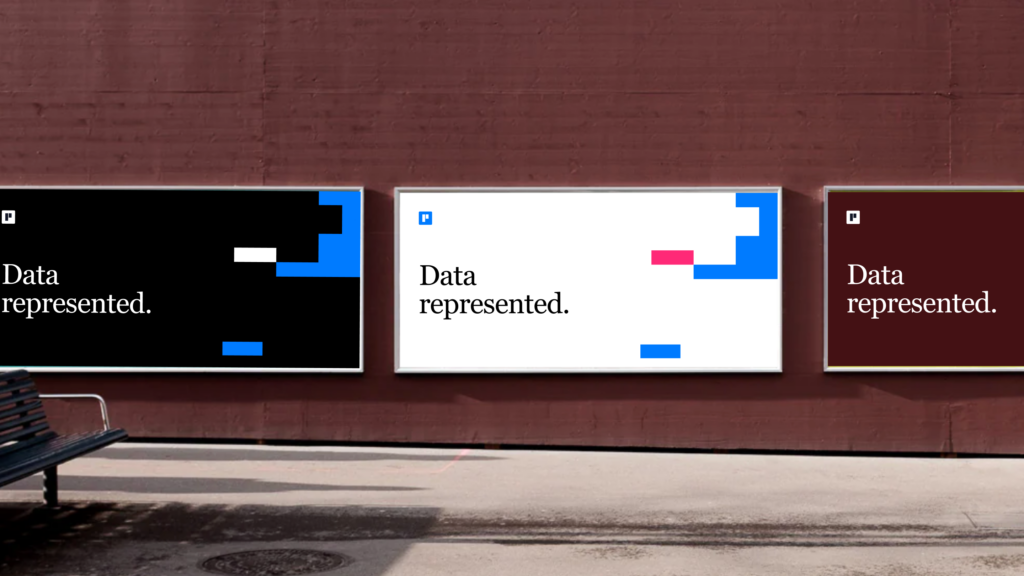
The identity had to work across the website, product UI, icons, reports and future tools. Because the assets needed to stay clear even at small UI sizes, the visual system was built around simple, scalable square-based forms inspired by Excel cells. |
| Brand positioning |
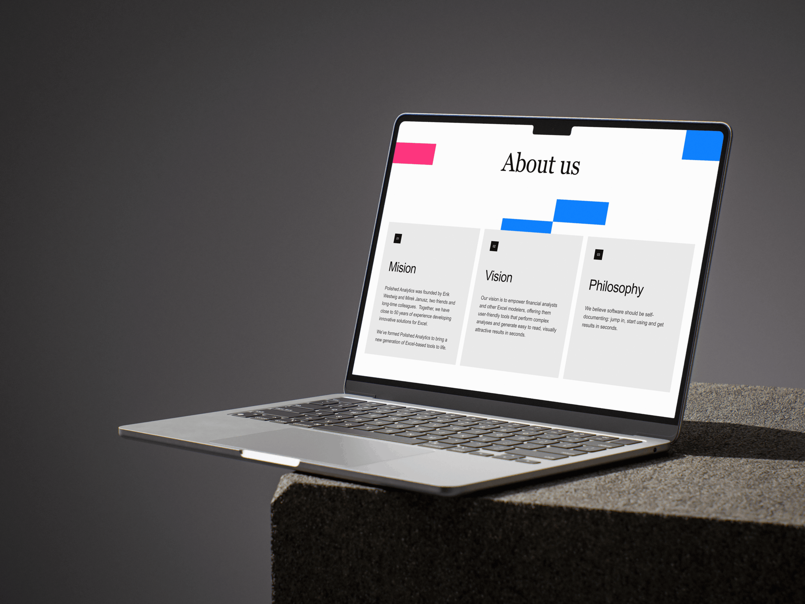
Polished Analytics needed to feel technical but accessible, minimal but distinctive, new but experienced. That balance shaped the logo, product identity, typography, colour system and website experience. |
“The challenge wasn’t making analytics look exciting. It was creating a brand that reflected decades of expertise while staying simple enough for everyday use.”
 | Tom Galecki, Founder, Human Creative |
“Human Creative took the time to understand the project, map out the scope, and help achieve it. This sounds like basic diligence, but it’s actually rare.”
 | Erik Westwig — President, Excel Software Architect |
Result
| Outcome |
|
| Transformation |
Polished Analytics started with decades of technical expertise and a complex analytical product. Through strategy, identity and digital design, we transformed that expertise into a clear software brand ready for launch, future products and long-term growth. |