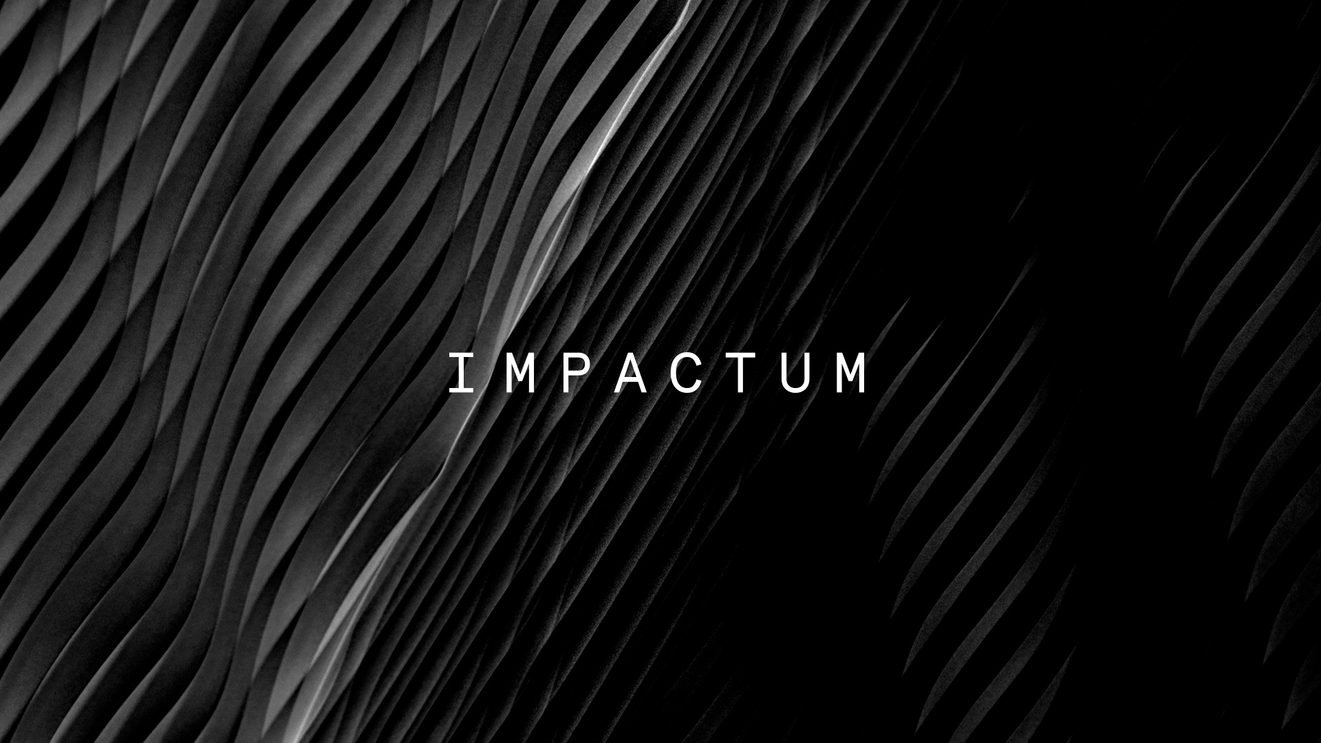
Impactum
About
| Project |
| Brand: Impactum |
| Client: Impactum |
| Year: 2020 |
| Industry: Construction |
| Location: Belgium |
| Deliverables |
| Visual Identity |
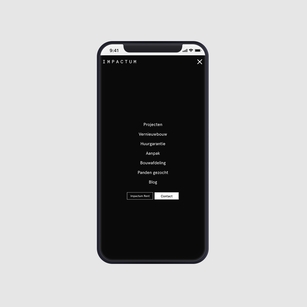
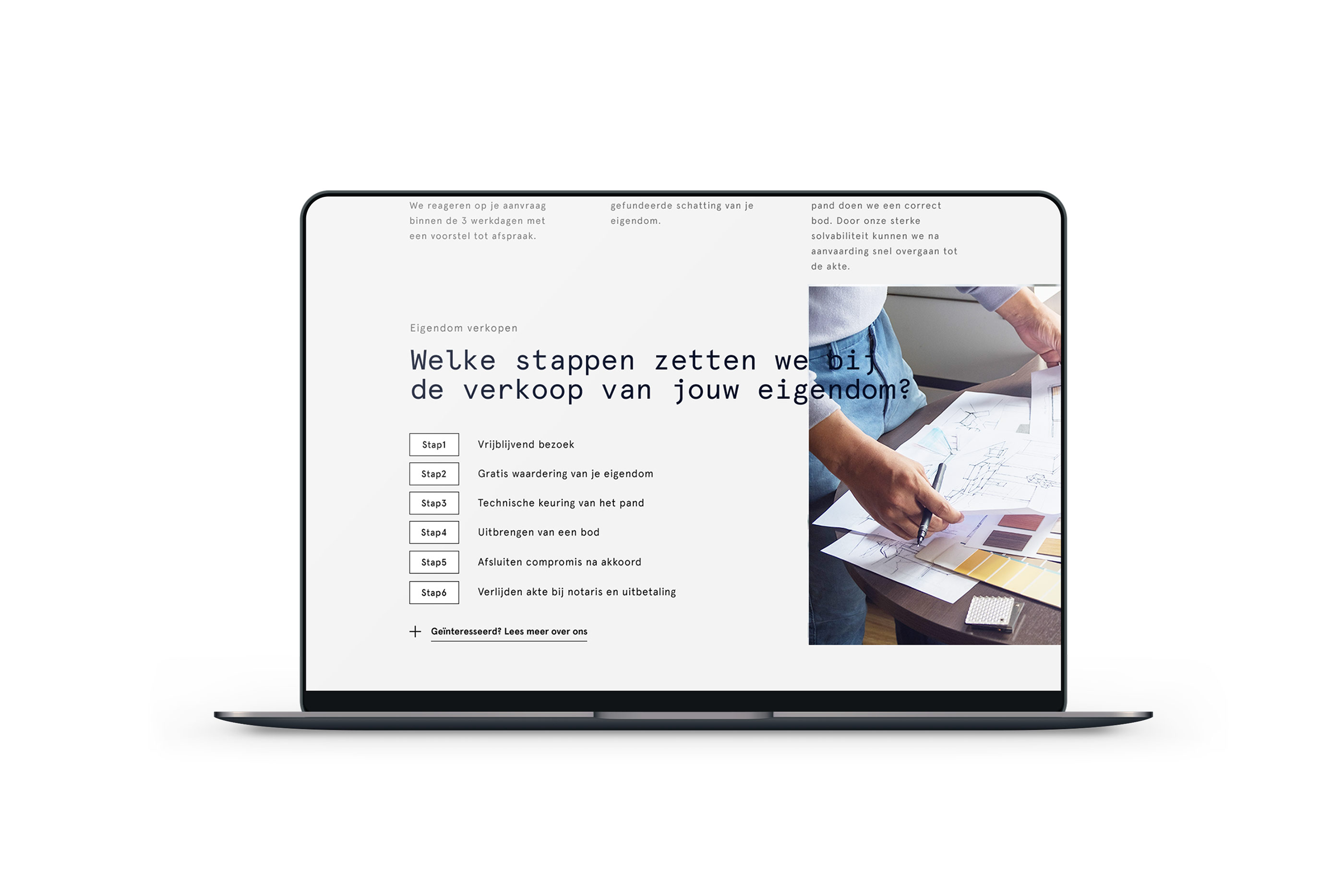
| Web Design |
| Web Development |
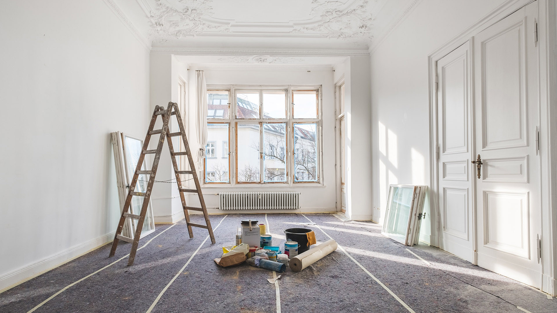
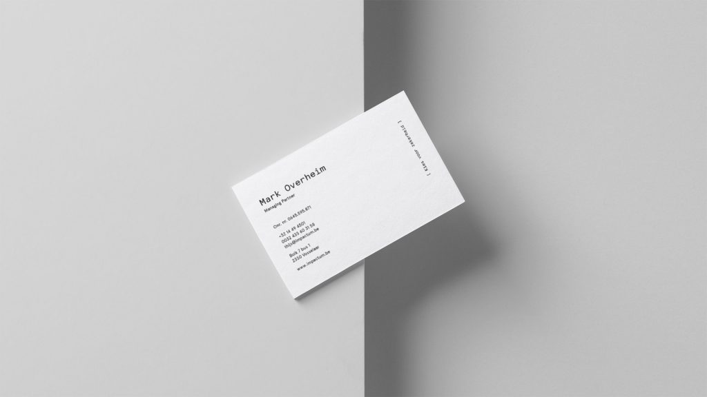
Impactum is a Belgian construction company. „We sell an idea, not a property”. – This is how the client described the company’s unique business model. In creating the new image of Impactum, we wanted to stray away from the presentation of a building in logo or signet, typical for the construction branch. Unlike other companies on the market, Impactum does not sell, but provides complex investment services, including consulting, rentals and current property maintenance. These elements became the inspiration for the logotype.
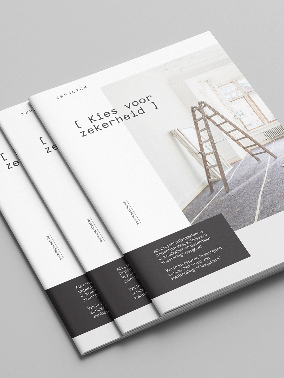
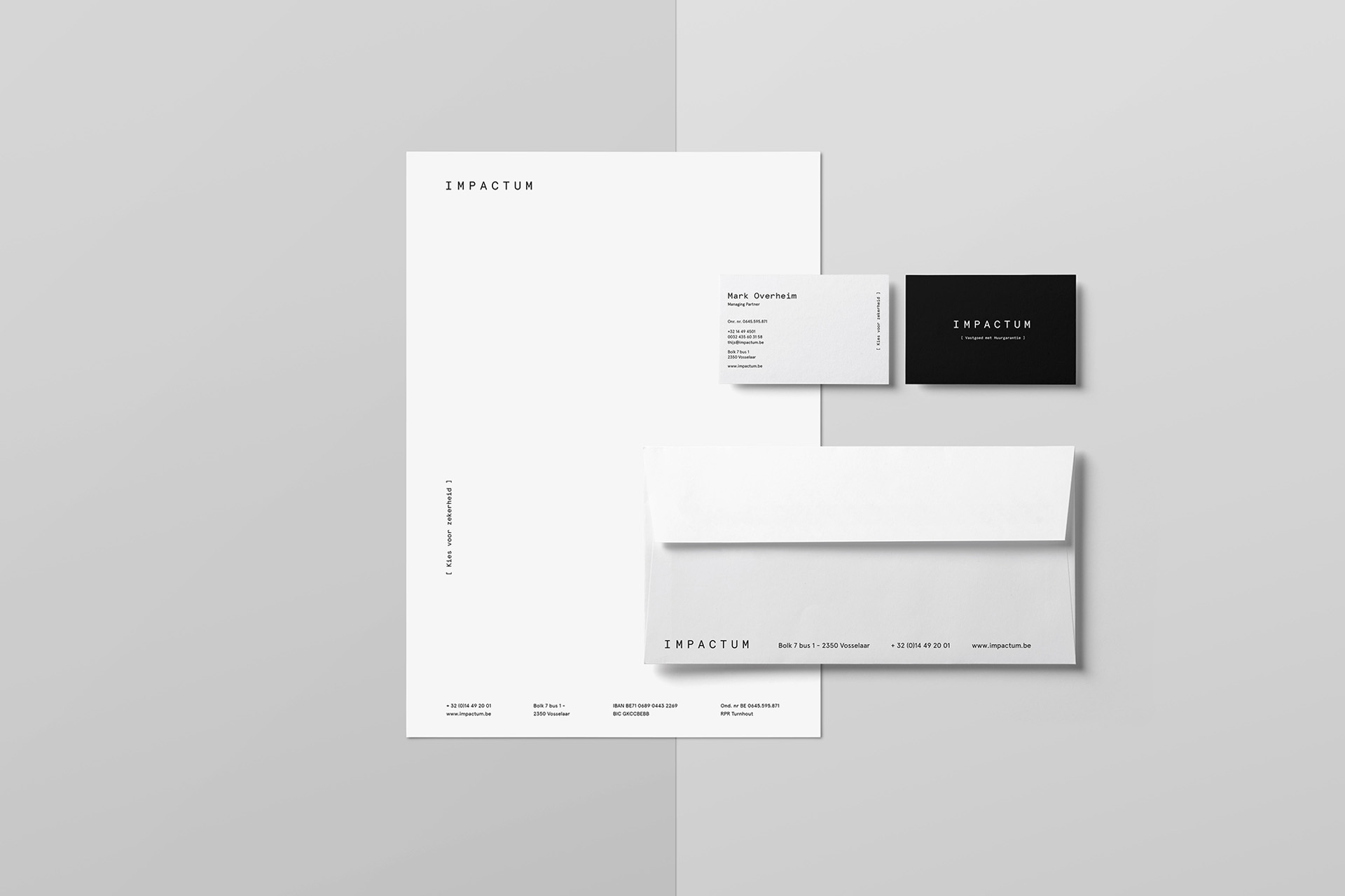
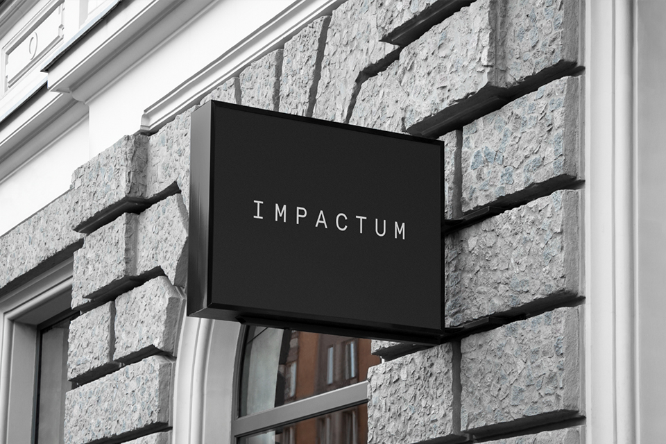
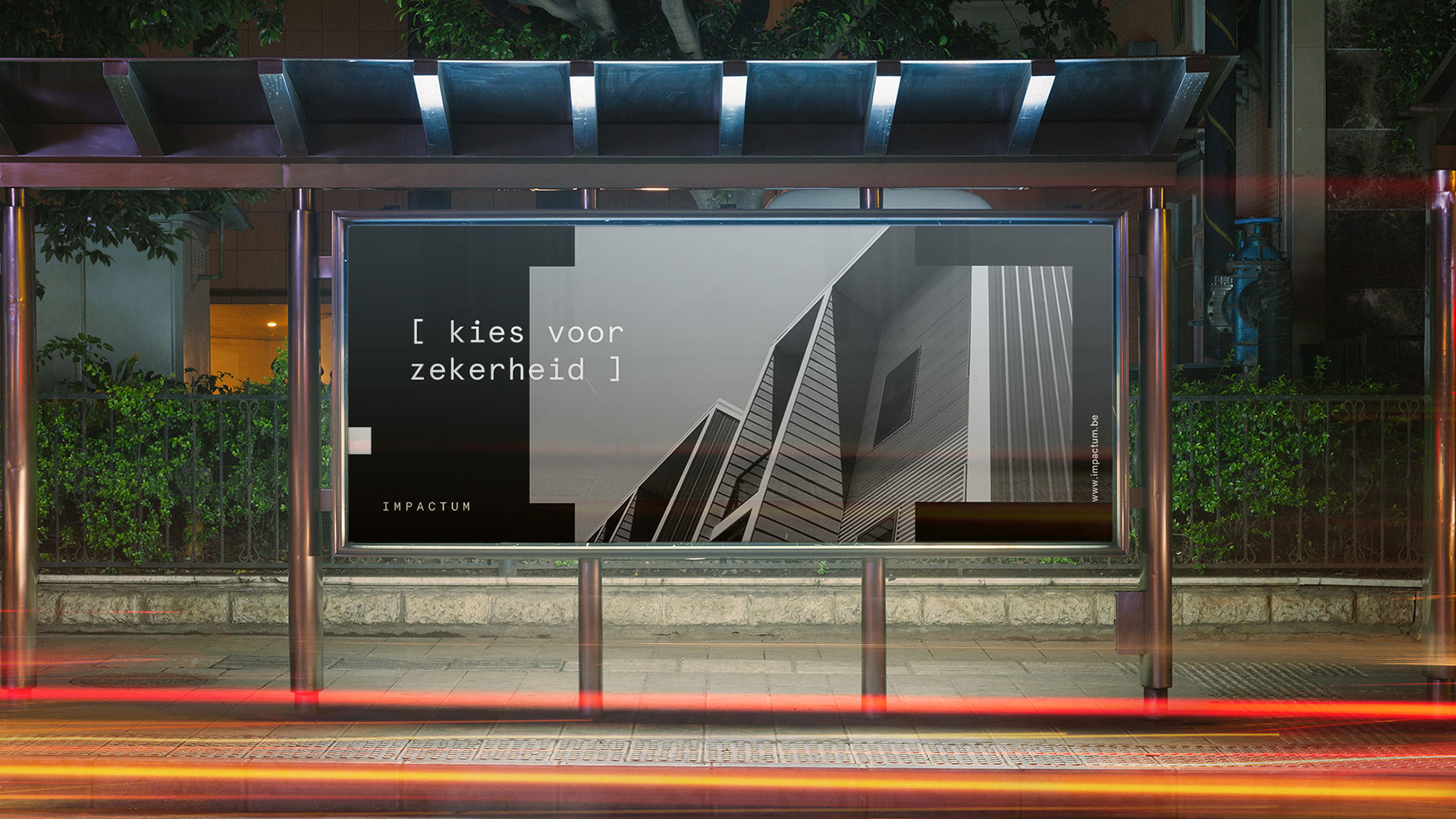
The identification is based on placing a claim or header in characteristic brackets, creating a distinctive but flexible system at the same time. The mathematical bracket motif symbolizes the comprehensiveness and transparency of the service, as well as the mathematical, strategic approach to the business analysis of the investment.
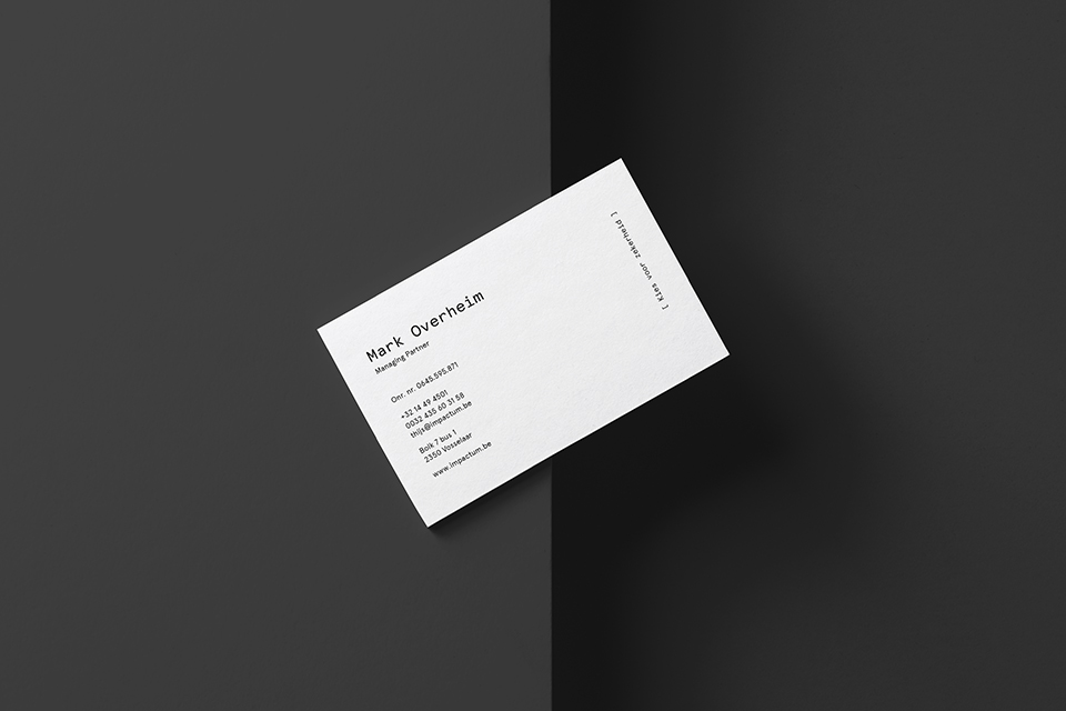

The company should be associated with trust, transparency and luxury.
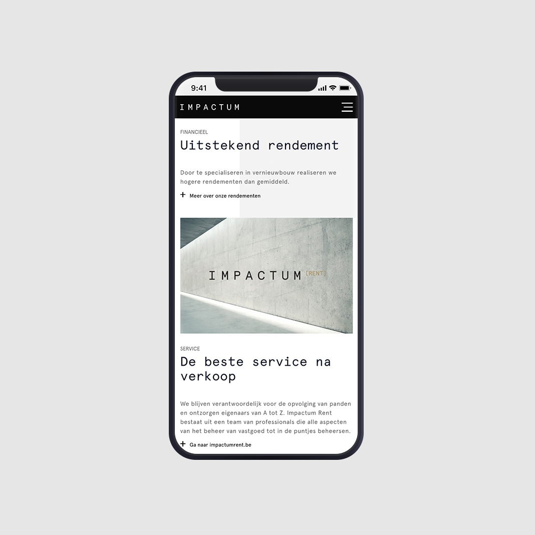
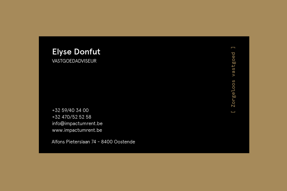
We also created a sub-brand of Impactum – Impactum Rent, which specializes in rental properties. Impactum Rent as a daughter company was supposed to be directly associated with Impactum, but at the same time different from it. Adding another color – gold – made Impactum Rent an autonomous brand, which can also be based on materials created for Impactum.
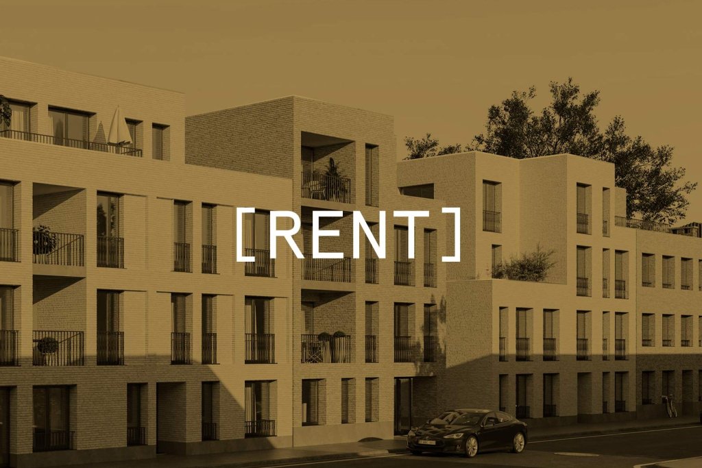
The mathematical notation [a+b+c] was translated into brand language
col-2 offset-md-12 col-md-6

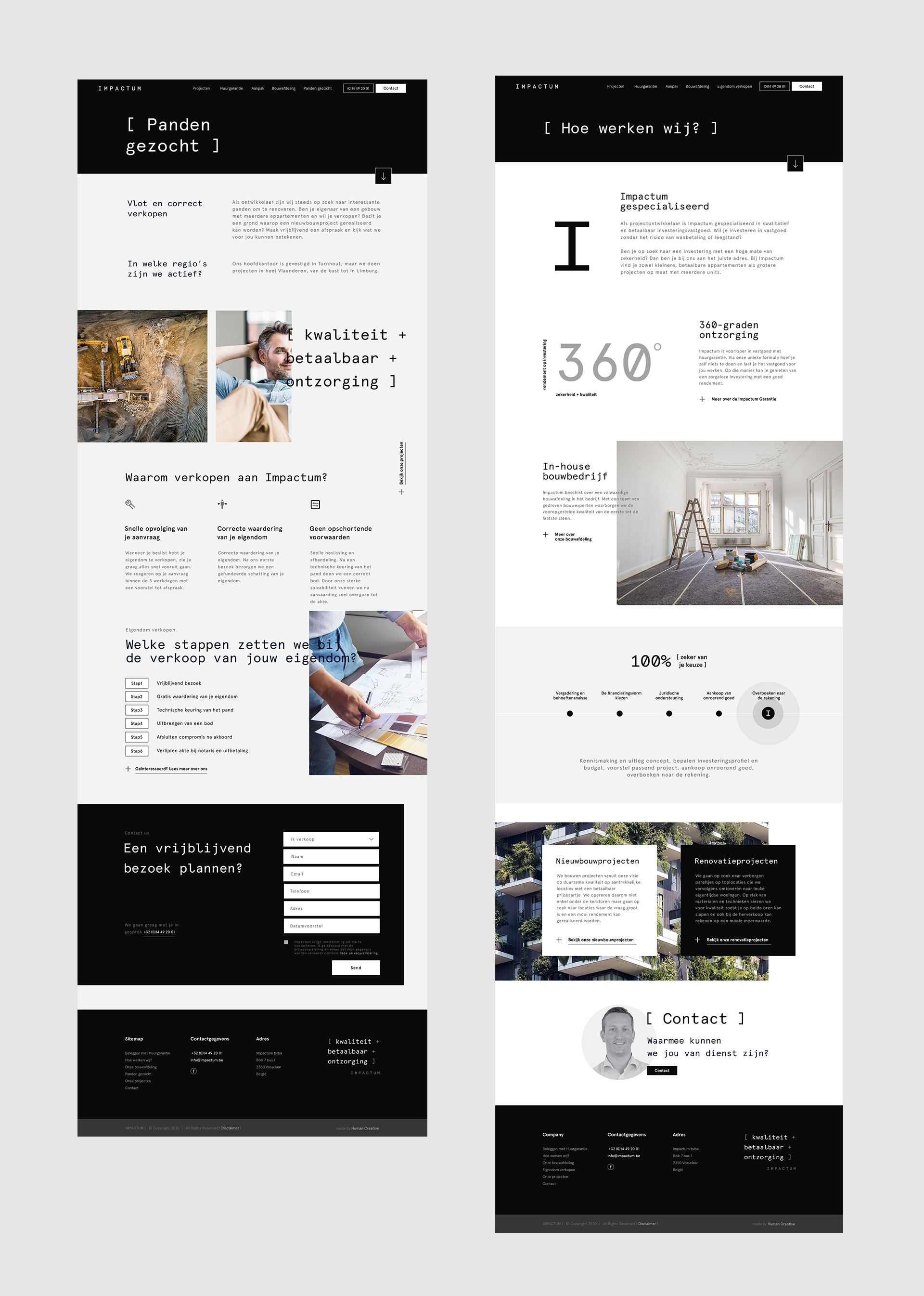
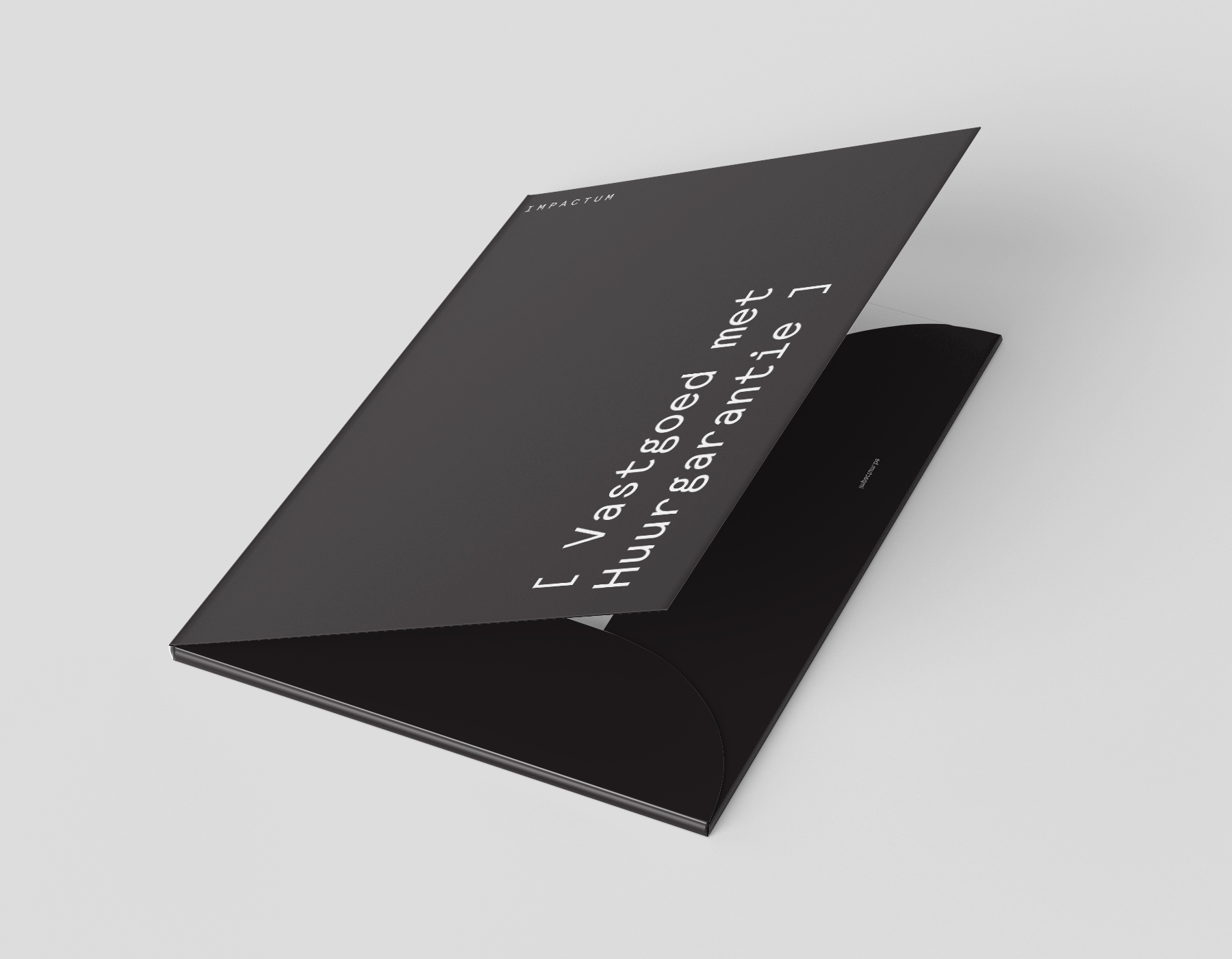
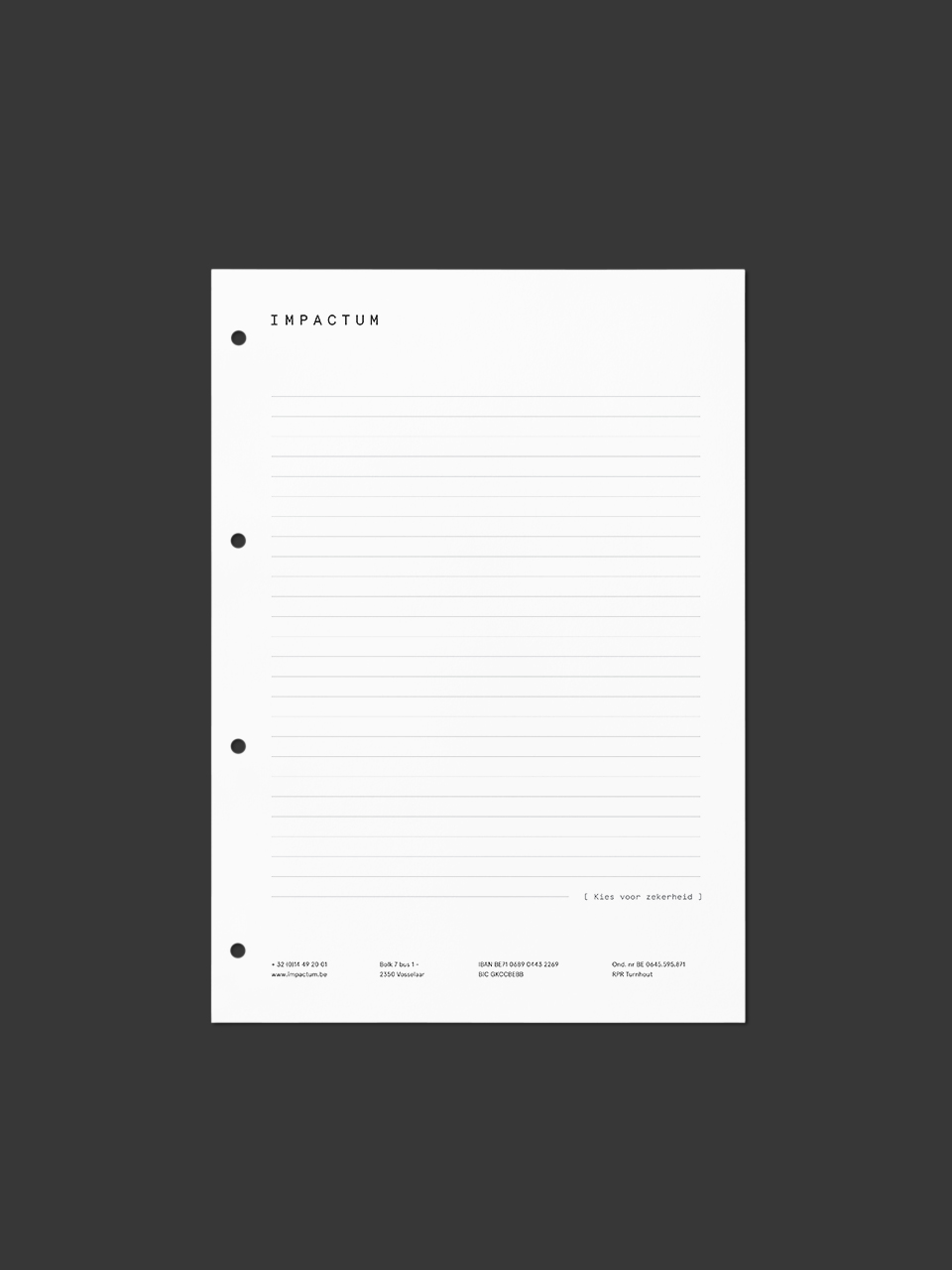
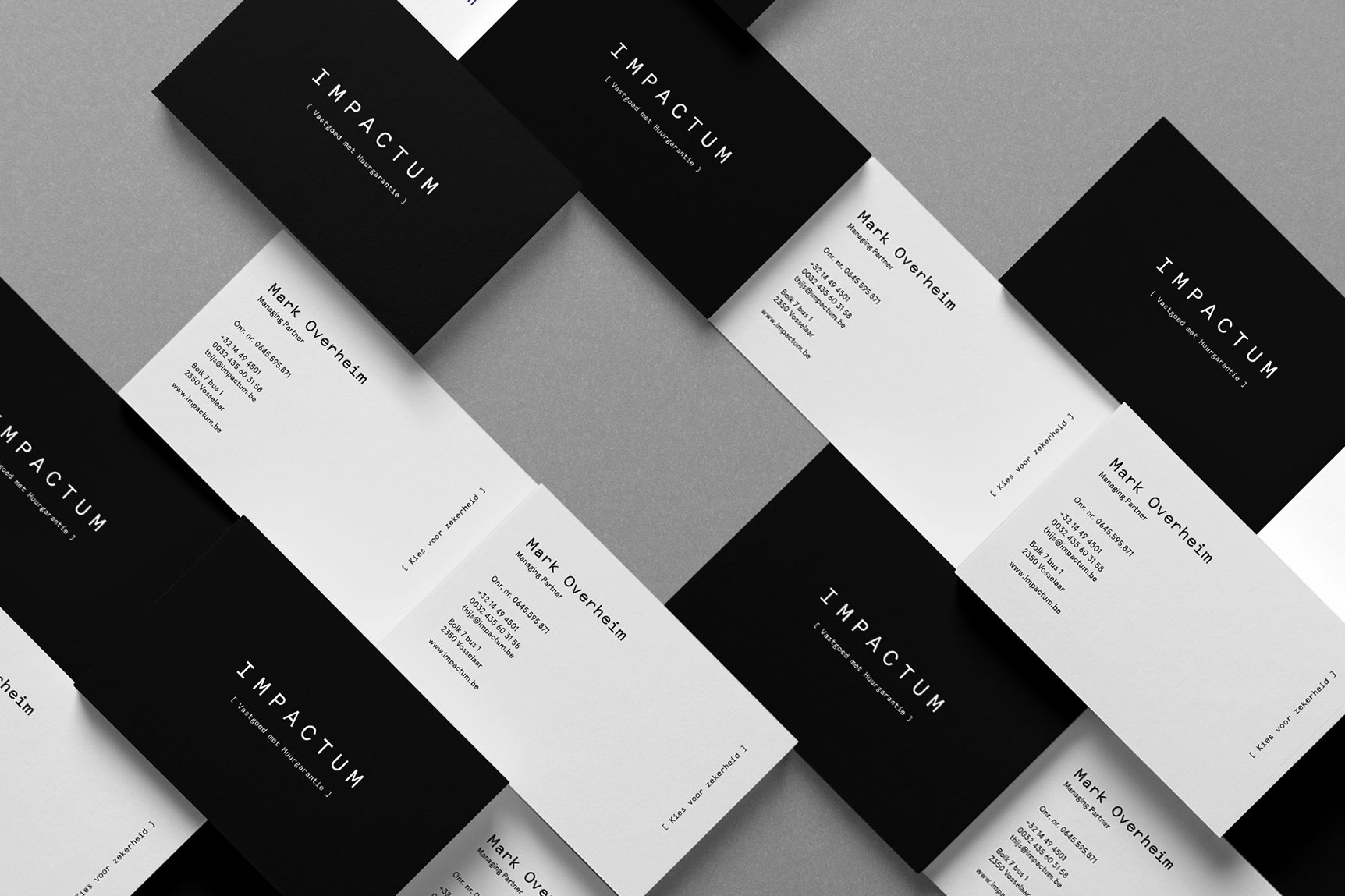
The minimalistic style was maintained throughout, based on white, gray and black.