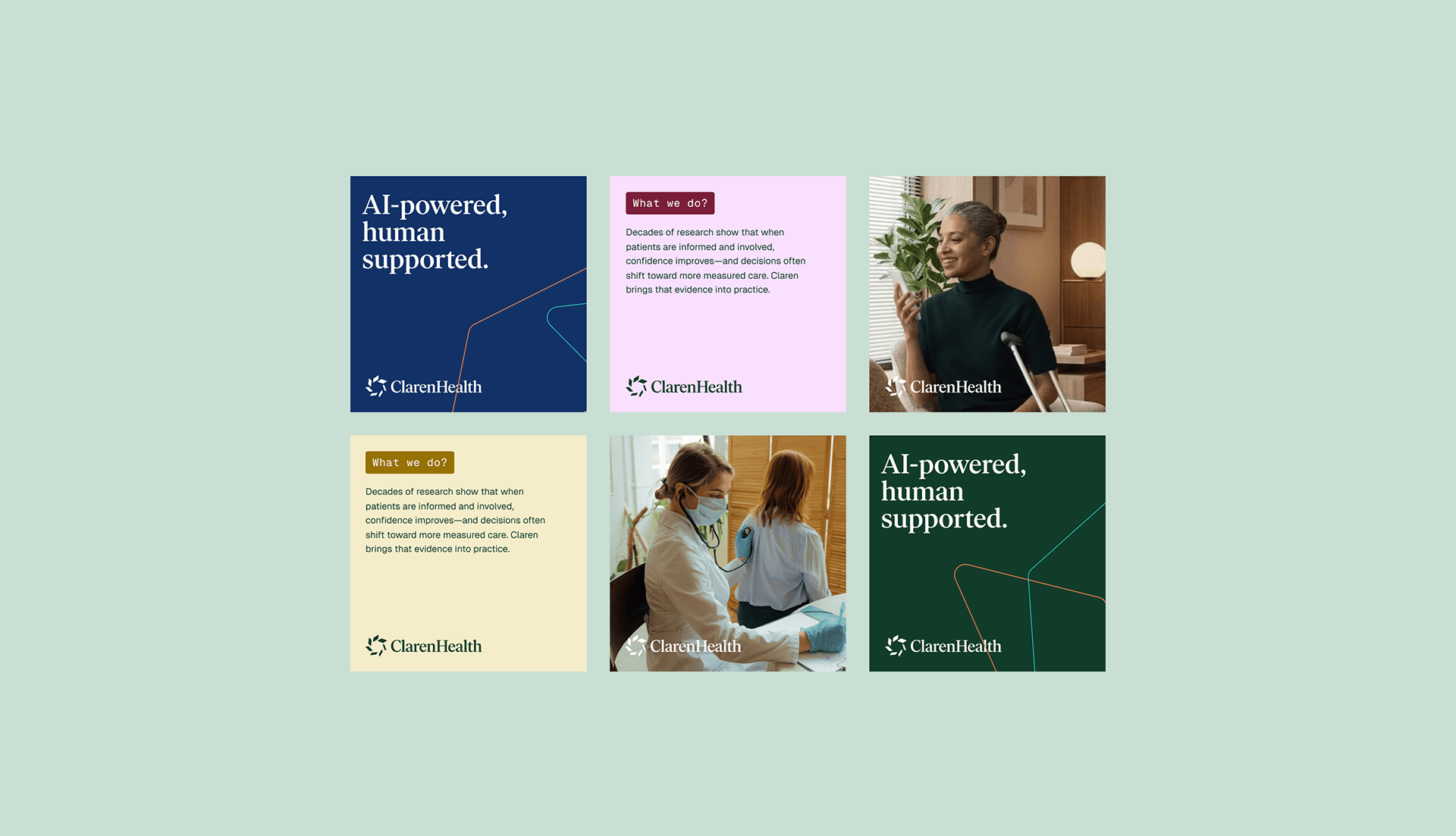
A familiar pattern has appeared across AI and technology brands: sans serif typography, black or white backgrounds, abstract gradients, soft 3D shapes, interface screenshots and a few futuristic details. None of these elements are wrong on their own. The problem starts when they become a substitute for actual strategy.
The New AI Visual Pattern
Every category eventually develops its own visual language. Finance has one. Healthcare has one. Luxury, logistics, architecture and consulting all have their own conventions that help people understand what kind of company they are looking at. AI is no different, but the category is still young compared with industries that have had decades to develop richer visual and verbal codes.
That immaturity explains part of the repetition. When a market is still defining itself, companies naturally look for signals that help them appear credible quickly. In AI, those signals have become predictable: clean interfaces, glowing gradients, abstract data visuals, dark backgrounds and language built around intelligence, automation and productivity.
Patterns are not the problem. Every industry needs shared codes so customers can quickly recognise the category. The issue is that many AI startups stop at the category code. They look like AI companies, but they do not explain what makes them specific, useful or memorable.
The Borrowed Credibility Problem
One interesting difference between startups and more traditional B2B companies is how they enter the branding process. In many industries, the first thing we hear during workshops is: “We are different, and we want to look different.” In startups, especially AI and technology startups, the conversation often starts with a list of benchmarks.
Those benchmarks usually come from companies that have raised large funding rounds, reached a new level of visibility or become admired within the startup ecosystem. The logic is understandable. If a company raised 120 million dollars and looks a certain way, then looking similar feels like a safer decision.
This is what we could call borrowed credibility. Instead of asking what makes the company different, the brand tries to absorb credibility from another company’s success. It may help the startup feel familiar, but it rarely helps it become more memorable.
The Benchmark Trap in Startup Branding
A benchmark is useful when it helps a team understand the market. It becomes dangerous when it starts replacing strategic thinking. In many startup projects, reference boards become less about understanding the category and more about recreating the signals of companies that have already been validated by investors.
That creates a strange tension. Founders want their company to look ambitious, but the ambition is often expressed through someone else’s visual language. They want to look like a future category leader, yet the result can make them look like one more company following the same pattern.
The problem is not inspiration. Every branding process needs references. The problem appears when a startup has a stronger benchmark list than its own point of view. At that moment, the brand is no longer being built around what the company believes, solves or understands better than others.
Category Aesthetics Are Not Positioning
Looking like an AI company is not the same as having a position in the AI market. A visual style can help people understand the category, but it cannot explain who the product is for, what problem it solves or why the company deserves attention.
This distinction matters because many early-stage companies confuse category aesthetics with strategy. They believe that if the brand looks sufficiently modern, minimal and technological, it will communicate ambition. Sometimes it does, but ambition alone is not enough.
A strong AI brand needs to do two things at the same time. It should feel relevant to the category, so customers understand the context quickly. It should also create enough difference that the company does not disappear into a wall of similar products, similar claims and similar visual systems.
Why Broader Experience Matters
At Human Creative, we do not work only with startups. We work with B2B companies, technology firms, financial organisations, healthcare brands, industrial businesses and consulting companies. That broader context changes how we approach technology branding.
It prevents us from treating every category as a fixed formula. Healthcare does not automatically need soft blue visuals and friendly serif typography. Web3 does not automatically need a dark interface and futuristic gradients. Fintech does not need to look like Revolut or Stripe simply because those brands shaped the category.
Every company still needs to be understood individually. Its market, buyers, product maturity, founder perspective and commercial ambitions all matter. The goal is not to make a startup look unusual for the sake of it, but to avoid the shortcut where “AI company” becomes the entire strategy.
Building a Brand That Belongs Without Disappearing
Our work with Keyring is a good example of this balance. The company operated in a space connected to technology, finance and Web3, but it did not want to look like a typical startup brand. The decision to work with us came partly from that concern. They wanted a partner who would not simply apply the usual startup, Web3 or AI aesthetic.
The project was not easy because several decision-makers had different opinions about how far the brand should go. That tension was useful because it forced the team to work through what the company needed to signal and where it needed to stand apart.
The final identity had to fit a startup and technology context, but it also needed to feel credible to more traditional financial and institutional audiences. That is often the real challenge in technology branding. A company needs to look ambitious enough for the future, but serious enough for the people expected to trust it today.
When Cybersecurity Doesn’t Need to Look Dangerous
Another example comes from our work with Light, a cybersecurity company from Hong Kong. Cybersecurity is a category with its own strong visual clichés: black backgrounds, hackers, shields, red alerts and a general sense of threat.
Light needed a different approach because the company itself represented a different perspective. The brand was built around a new generation of cybersecurity thinking, one focused less on fear and more on simplicity. The name itself pointed us in a different direction: lightness, clarity and making cybersecurity easier to live with.
That led to a visual and verbal system that moved away from the typical dark, intimidating cybersecurity mood. The core idea, “Simplify cybersecurity to your sLightest concern,” captured the brand’s role clearly. It still belonged to the cybersecurity category, but it did not rely on the usual language of danger and complexity.
Common Signs Your AI Brand Is Too Generic
AI startups often notice the problem only when they start comparing themselves with competitors. Internally, the product feels unique because the team understands the model, workflow, data layer or technical approach. Externally, the brand may still look and sound like dozens of other companies.
Some common warning signs include:
- your visual identity relies heavily on gradients, abstract 3D shapes and generic interface shots,
- your messaging uses phrases like “unlock productivity”, “AI-powered workflows” or “intelligent automation” without explaining what is actually different,
- your website looks credible but could belong to several other startups in the same category,
- your benchmark list is stronger than your own strategic point of view,
- your brand feels designed for investors more than for customers,
- your product is specific, but your communication stays at the level of the category.
When these patterns appear, the problem is usually not visual execution. The problem is that the brand has borrowed too much from the market and translated too little from the company itself.
Final Thoughts
AI startups often look the same because they are trying to become credible in a category that is still defining its own language. That is understandable, especially when speed, funding and market perception matter so much.
But borrowed credibility has limits. A company can look like the market and still fail to explain why it matters. It can feel modern and still be forgettable. It can follow the visual language of successful startups and still have no clear position of its own.
The next generation of strong AI brands will need more than category aesthetics. They will need sharper thinking, clearer communication and a better understanding of what makes them different from the companies they admire.

By Tom Galecki
Founder, Human Creative
Tom Galecki is the founder of Human Creative, a strategy, branding and website studio working with B2B and technology companies across 24 countries. Over the last 14 years, he has helped more than 120 organisations clarify their positioning, communication and digital presence.